Showing posts with label swatches. Show all posts

Monday, November 18, 2013

Review & Swatches: Maybelline LE Gilded In Gold Collection

This year Maybelline came out with the best thing ever to hit drugstores and they are the limited edition color tattoos from the Gilded In Gold Collection. If you don't know already then this holiday collection has three limited edition color tattoos. All of which are matte shades!
 **CLICK PHOTOS TO ENLARGE**

I know a lot of ladies compare these to MAC paint pots but honestly I don't know. I do not own any paint pots so I'm not even go to go there and start comparing. I couldn't find these in my local stores so I found a lady on a facebook group who had found them and was willing to ship them to me. All I paid was the price of the tattoos and shipping charges, so thank you Tiffany if you're reading this. Anyways, the three shades in the collection are in the colors 255 Just Beige, 250 Nude Pink, and 260 Matte Brown (from left to right shown in photos).

I think the shade I was most excited about and tried on the instant I received them was the shade in Just Beige. To me, Just Beige is a warm concealer shade but with an added bonus of being long wearing and water proof.
Nude pink is more of a muted, pale, lilac shade rather than a pink color. In the pot it looks more like a mauve-y, dusty, pink so the shade in the pot versus the actual shade you get when applied are different but it is none the less a very gorgeous shade. Great base for purple smokey eyes or any kind of pinky purple look.
The last of the three shades is Matte Brown. Obviously by the name I'm pretty sure you can tell that the color tattoo is matte brown. Off topic but this shade reminds me a lot of smeared chocolate or coco powder when swatched.

I love the Maybelline Color Tattoos as a whole but I think I am going to favor this collection a lot more than the rest of the shades that I already own. These shades are just as long wearing and water proof as any other shade. I did a swatch test just to see how long the shades would last and they stayed put for about a good 18-24 hours on my hand. They went through 2 showers, dish washing, cooking, cleaning, and farm work so these are definitely a must have for any makeup junkie.

Tuesday, September 24, 2013

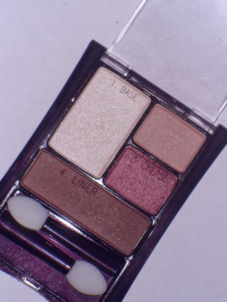
REVIEW: Maybelline Expert Wear in Designer Chocolates

Today's blog post is on the infamous quad in Designer Chocolates by Maybelline. This quad was featured on beautybroadcast.net or also known as EmilyNoel83 on youtube.com. Ever since seeing Emily use this quad I was intrigued and had to get my hands on it. The quad retails for $4.95 on walmart.com but I purchased mine at a Dollar General out in the middle no where so it was slightly higher, about $5.25 or so.


The quad obviously has four shadows, numbered 1 through 4. Shade number 1 is the base shade which is the lightest. Shade 2 is the lid color in the top right corner. Under that is the crease color, shade number 3 and on the very bottom is shade number 4.

With Flash
 

Without Flash/Natural Lighting
**for some reason my camera just would not focus...sorry for the blurry photo**
 
As you can tell from the swatches the colors have a decent amount of payoff. Personally, I think this is a great travel friendly item. Something you can take with you and if it breaks it's a no biggie.
 
 
**NOTE: I know my eye brows are getting bushy. I'm growing them out so that I can change the shape.**
LOOK #1:
 
This is the look I created using the quad the first time I used it. It came out pretty nice if I do say so myself. Something thats neutral and very wearable for every day.
 
GET THE LOOK:
1. Prime lids.
2. Apply liner shade to outer v and blen inwards.
3. Take the crease shade and blend out the harsh edges of the liner shade.
4. Apply base shade all over the lids and into the inner corners.
5. Take lid shade and use as the transition shade from the crease shade into the highlight.
6. Take base shade again and apply on browbone to highlight.
7. Apply mascara, liner, false lashes(optional) and you are done!
 
LOOK #2:
 
This is the second look I created. It's probably going to be more for color lovers but because I used the brown shades on the outside it is a little bit more wearable for every day also.
 
GET THE LOOK:
1. Prime lids.
2. Apply crease shade 3/4 of eye.
3. Take liner shade into outer v and blend inward.
4. Take the lid shade and blend out the liner color that you just put down.
5. Hightlight inner corners and brow bone with base shade.
6. Apply mascara, liner, and false lashes(optional) and you are done!
 
As a whole I really enjoyed this palette. For the price that you pay for this quad it is competely worth it. I'm actually debateing about searching for another Maybelline quad in Emerald which I found earlier seaching for the price of this quad on Walmart. Until then see you guys later!


Sunday, September 8, 2013

REVIEW: CoverGirl Lip Perfections

I am finally doing my post on the CoverGirl Lip Perfections. If you watch my videos then you know these were in my haul video that I promised to review. The three shades I have and will be reviewing today are number 200 sultry, 365 enchantress, and 305 hot.


My initial reaction to these lipsticks was that I really liked enchantress. Sultry I thought was too brown and I probably wouldn't be able to get much use out of it. As for hot I just wanted to try out a red lipsticks since I have never owned a red lipstick.

SWATCHES:
L to R: Sultry, Enchantress, Hot
Top to Bottom: Hot, Enchantress, Sultry

After swatching and using the lipsticks for well over a month my opinions changed and my preference is actually the opposite of my initial thoughts. I actually really like Sultry, not very fond of Enchantress, and I'm pretty satisfied with Hot being my first choice for venturing out into red lipsticks.

LIP SWATCHES:
This is a before photo with just some lip balm and zero lipstick. As you can see my lips are pretty pigmented by themselves.
In this photo I have on Sultry. It is a gorgeous your lips but better kind of color. In the tube the lipsticks rather brown and looks almost unwearable on my skin tone. However, when applied the lipstick is actually pinker in color and has a nice sheen.
Swatched here is the shade Enchantress. I thought I was going to like this shade just because it was pink. I ended up not being a fan as it has a blue opalescent sheen to it. I think that if this shade did not have that duo chrome affect to it I think I would of really enjoyed this shade.
The last shade is in Hot. As you can see its a blue toned matte red shade. In the photo it looks like it has a sheen to it but it really is matte. Oddly this lipstick was the only one out of three that I have that feels kind of dry and stains my lips.
Here is a before and after comparison of how the lipstick stained my lips.

The thing I like most about these lipsticks is that they have this unique smell to them. As a whole I really enjoyed these lipsticks and I actually wouldn't mind picking up more colors to test.

**FUN FACTS**
1. We are celebrating my mom's 61st birthday today.
2. If you look closely you will see my kids are in the background of most of todays photos.

Saturday, August 3, 2013

REVIEW: E.L.F. 24K 32 Piece Eyeshadow Palette

I finally had time today to put up my review and swatches of the ELF 24K 32 piece eyeshadow palette. Which, I know I've been promising to do more reviews so I hope you can forgive me and keep following me on my makeup journey. It's been hard trying to find time to do swatches, taking photos, and I'm not even going to mention filming videos because it's been really hectic. Anyways, I'm going to stop rambling so that we can get straight in to this amazing palette.

A LITTLE HISTORY...
This palette was a limited edition palette launched a year or so ago for Christmas from ELF's 24K line. As you can obviously guess there are 32 eyeshadows. All ELF palettes are hit or misses for people but personally I think this is a HIT. There are a few shadows here and there that aren't as amazing as you would want them to be but for the price it's no biggie.

I purchased this about a year or so ago but never got around to using it because I wasn't really into using colors in my everyday makeup routine. Naturally I steered clear of this palette. I've finally broken out of my shell and I find myself experimenting with colors everyday so I thought I would give my two cents on the palette. Even though this palette is no longer available I thought it something worth sharing.

COLOR SELECTION...

 TOP: With Flash
BOTTOM: Without Flash
As you can see there is a nice selection of colors. Blues, blacks, greens, purples, browns, and even a gorgeous coral.

SWATCHES...
First Row
 
The first row has a lot of lighter colors. I love to use the first color as a highlight shade but it is rather chalky so you have to be careful with it. The gold shade(3rd swatch from the right) is a beautiful all over the lid color for summer if you're going for that golden goddess kind of look. The pink shade(4th from the left) is a pretty pink color that reminds me of sin from Urban Decay. I'm not saying its exactly the same I'm just saying it reminds of Sin.
This is the look I created using the champagne color(2nd from left). I used this color on top of a Maybelline Color Tatto in order for the color to pop. By itself it wasn't really opaque enough to my liking but it really is just personal preference.
Row Number 2

My favorite color out of this row is definitely the coral color(2nd from left). My least favorite out of these is definitely the sparkly black. when swatched there is little to no pigment. Just mainly glitter with a lot of fall out. The two least favorite of mine are the two middle colors. The pink and lilac shade are very misleading in the pan. In the pan the pink shade looks like a lilac and the lilac shade in the pan looks darker and more pigmented. These two colors were very depressing for me as I really liked the way they looked in the pan. But like I said the shadows are hit or misses.
This is the look I did with the coral shade. As you can see it is rather pigmented and blends beautifully.
3rd Row

I love the turquoise and the icy blue shades in this row. Sadly the turquoise shade almost completely blends away to nothing which is very sad. Especially when it swatches so true to color. However, that might have been because I used the shadow under my eyes instead of packing the color on. I might try using this color a little bit more on the eyes instead of smudging out the color under my eyes to see how much better it does.
Row Number 4

This row I love the 4th,5th, 6th, and 7th swatches. The 4th swatch is a gorgeous deeper bronze/rose gold shade. Swatch number 5 is a perfect transition color to bring some warmth into your eyes. The 6th swatch is a really pretty mossy green and the 7th is just a nice pop of color.

As a whole I really like this palette and I very much did enjoy it. There were some hit or miss shadows but that's fine by me as it is ELF so I don't expect Urban Decay kind of quality. With only a couple of duds I think this palette is an awesome find and something worth trying if you can ever find it ever again.

If you like this kind of post then I will most definitely be doing more in the future. Thanks for reading my review and I will see you guys all later.

Sunday, March 3, 2013

Benefit Watt's Up! VS Wet N Wild Walking On Eggshells

I know that highlighting is something that not everyone does on a regular basis. However, I know that purchasing a decent highlighter can be a little expensive so that is why I found a nice little dupe for the infamous Watt's Up by Benefit. I received this as a birthday gift from Sephora last month and I've been loving it and even considered repurchasing it. When I was applying this it kind of reminded me of the eyelid color from the Wet N Wild Walking on Eggshells 3 pan palette. Thus I decided to swatch them to see how similar they were and they are pretty similar. I'm not saying for you to go out and buy this palette but I just wanted to share my thoughts on this. Not everyone has the same skin tone so this may or may not work for you but it should apply the same for the majority of skin colors.

Obviously from the photo of the swatches you can tell they are pretty similar. The top swatch is the Watt's Up! by Benefit and the bottom swatch is the eyelid color from the Wet N Wild palette. I did have to build up the Wet N Wild color just a little bit but none the less it's a pretty decent dupe. Like I said I am only giving my opinion and if you like the Benefit Watt's Up highlighter definitely check out the Wet N Wild palette if your searching for a more affordable highlighter that has the same color of the Benefit Watt's Up, plus two other eye colors.

Hope you guys enjoyed this quick post and I'll be seeing you guys later!

REVIEW OF - Physicians Formula Sexy Booster Sexy Glow Blush in Natural

If you followed me on LUUUX then you know that I picked up the Physicians Formula Sexy Booster kit from Wal-Mart a few weeks ago. I have used this a few times and I honestly just don't like how it looks.
Here are individual swatches of the colors. The darker swatch on top is the color of the shoe and the lighter swatch on the bottom is the color surrounding the shoe. When swatched the colors do not seem too glittery but when actually applied its very glittery. I'm not feeling the blush right now but I noticed that after a couple of uses the glittery heel part disappeared and there wasn't as much glitter. I'm going to be giving this blush a few more tries just to see how it looks after the golden glitter heel completely disappears.

I didn't take a photo of this but the back has compartment with a blush brush which is really prickly. Behind the actual brush is a little mirror. I guess the packaging could be almost travel friendly if it wasn't so bulky. The packaging is cute however, I'm not a person who buys items solely on their packaging. Hopefully I will end up liking this blush after a few more uses. If I don't like it then I have not idea what I'm going to do.